As the old cliché goes, a picture is worth a thousand words. That is definitely true for the theatre world. A typical UTBA review is approximately 1,000 words long, but a single image can say as much about a production as a review. Publicity photos for plays are especially important sources of information about a play — but only if they are good photos.
I have been editing and publishing reviews for UTBA for 12 years, and in the course of a year, I probably see over 1,000 publicity photos for plays. Based on my experiences of evaluating and selecting publicity photos for publication, here are some guidelines for taking and using good publicity photos.
Characteristics of good theatrical publicity photos
High-resolution
Good publicity photos are high resolution images that have no blur or fuzziness in them. A photo may be zoomed in or cropped, and the best photos can take this treatment well because they were taken as high resolution images.
Show the actors

The best publicity photos depict actors dressed in costume, posing as their characters. Avoid early rehearsal photos, head shots, and backstage photos.
Usually, it is best to show no more than approximately 5 actors in a photo to prevent it from looking crowded. If possible, take a photo depicting an iconic moment from the play. If it is a famous play, then people should be able to correctly guess the show just by looking at the image.
Showing the actors in a photo may sound like a no-brainer, but I have seen publicity photos submitted to UTBA that show just a prop or the set. Such photos are usually ineffective.
Just the image, please
When possible, there should be no words or images added to the photo. These are distracting (especially when the words are large) and can cause problems when these images are used on social media. Additionally, media outlets may have rules against using images that have been noticeably modified.
Occasionally, a photographer will insist on printing their photo credit on the image, or a theatre company will have a rule to include a logo on each image. If this must occur, then the words or logo should be small and unobtrusive.
Avoid wide shots (and think small)

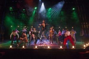
In person, a view of the entire stage may look great. This is especially true for a big musical, where a large dance number can be a vivid stage picture. But wide shots rarely work well for publicity purposes in theatre. At UTBA, over 60% of visitors view the site on a mobile device. On a cell phone, the people in that wide shot look like they are about half an inch tall. When taking publicity images, ask yourself, “Will this photo look good on a cell phone?”
Avoid the green screen
If a photo is taken in front of a green screen and the background replaced by an image, it looks very phony. The best photos are taken on the set of the play or at a location that is evocative of the play’s setting. If nothing else is available, use a generic background.
For action shots
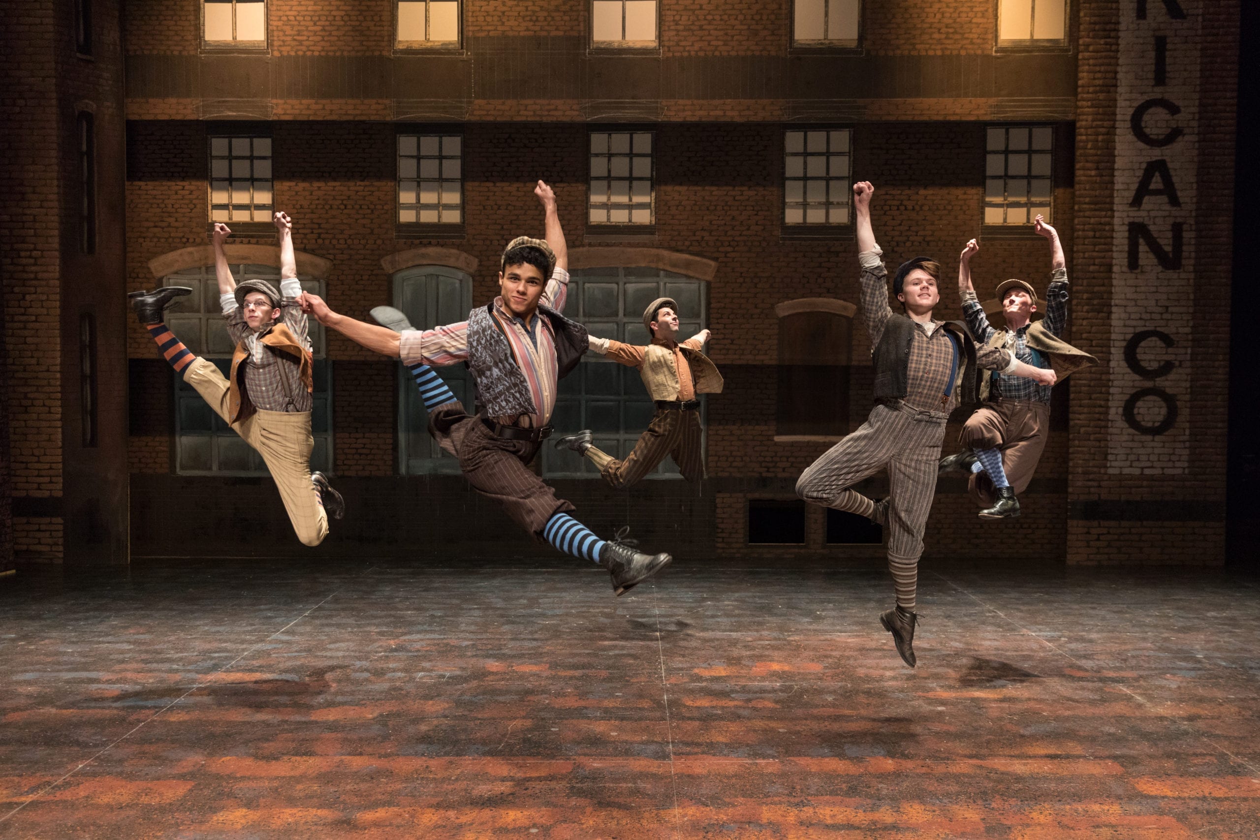
Action and motion shots (like the one at the top of this post, which was taken for Newsies at Pioneer Theatre Company in 2017) are great. But if you take shots of actors in movement, invest in a good camera. This is also true for photos taken during a rehearsal or performance. Low-end cameras or cell phone cameras will produce blurry images of dancing, stage combat, and other movement.
Don’t fret if your company doesn’t have access to a high-end camera. It is possible to take great publicity photos with a cell phone. Avoid the action shots if you use a phone or low-end camera, though.
Using photos to publicize a play
After you have taken your great publicity photos, the job is not done. You now have to choose which photos are going to be released to the media or used on social media web sites.
Submitting to a media outlet

If you are submitting photos to a media outlet, you should plan sending at least four photos so that the editor has options. The collection of images should include some in landscape orientation and some in portrait orientation. This reduces the need for cropping to fit a media outlet’s formatting requirements.
Also include the photographer’s credit and a caption for each photo. The caption should include each actor’s name and the role they play. For example: “John Gonzalez as Harold Hill.” If multiple people are in the image, the caption should unambiguously state who each person is. This is easiest by starting the caption with “Left to right:”, “Clockwise from top left:”, or “Top row: . . . Bottom row:”.
Submit photos as a link to a Google Drive (or other file sharing service) or a URL where images can be downloaded. This avoids clogging up the email inboxes of the editor. Send your photos to the media outlet as early as possible. If an editor has your production’s photos before the writer submits their review or article, then it will speed up the publication process.
Using photos on social media
Social media is a great way to reach potential audiences and to spark interest in a play. It is also a very visual medium, and that makes having good publicity photos essential.
The best social media strategy is to post repeatedly about the show. To keep these posts fresh, do not reuse the same image too many times. It is best to have a pool of usable photos to choose from when posting on social media. I like to have at least three different photos per week that the show is open. (This is just my personal preference. I have no strong evidence that this is the “right” number.)

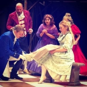
Also, be aware of the image needs of social media. On Instagram, a post has a 1:1 aspect ratio (i.e., it is a square image, like the Cinderella photo at right). A story image on Instagram, though, has an aspect ratio of 9:16 (i.e., the same ratio as most smart phones when held vertically). On Facebook, a post has a 1.91:1 aspect ratio and images are often cropped automatically to fit this size. On Twitter, the default is a 16:9 aspect ratio (i.e., the same as your TV), but images are not cropped. Instead, Twitter selects a portion of the image to show in 16:9 format, but users can click to see the entire image. This automatic process often works well. (It is trained to select faces, for example.) But it is not guaranteed to work properly.
It is unusual for one photo to work for all these different aspect ratios. Instead, it is best to have a variety of photos so that each social media outlet gets images that work well. This may require some cropping to fit the some aspect ratios, but it is worth it. Taking photos with different aspect ratios in mind will help reduce the need for cropping.
Embrace the visual
I hope that these tips can help your theatre company take and use good publicity photos. They may seem overwhelming and detail-oriented, but following these guidelines will greatly enhance the appeal of your publicity images. Theatre is a visual medium, and having good publicity photos showcases the visual elements of a production. And if a picture really is worth a thousand words, then good publicity photos will speak volumes for the quality of the work on stage.
